

Hello – it’s Tom here – for a change. Kate is busy working on her Islay project, and I’m taking a break today from shipping out orders. I wanted to say thanks so much for your interest in our Shetland Oo book. Apart from being my first major project as a photographer, Oo is the first book that I’ve made entirely in-house: that is, as well as being responsible for all of the images in the book, I developed the book design, selected everything from paper and formats to finishes, worked on the layout, and managed the print and production process. It has been an interesting task, and one I’ve really enjoyed.

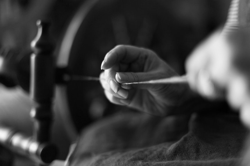
My governing idea behind the book was to celebrate the working life of a distinctive local industry – Shetland wool. Much of the work that’s done with wool is invisible or overlooked – historically, I think, because it was frequently performed by women, in their own domestic spaces. So I wanted to show how much hard work and incredible skill goes into work with wool, and I’ve often used black and white photography to illustrate this in the book. I think that black and white images are not only great for depicting form and conveying texture but that, free from the distraction of colour, the medium itself can confer an immediate dignity on a subject. This sense of the dignity of work was what I wanted to highlight, particularly in my photographs of women like Ina, Elizabeth or Emma engaged in the skilled activities of spinning or knitting.
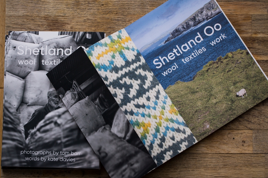
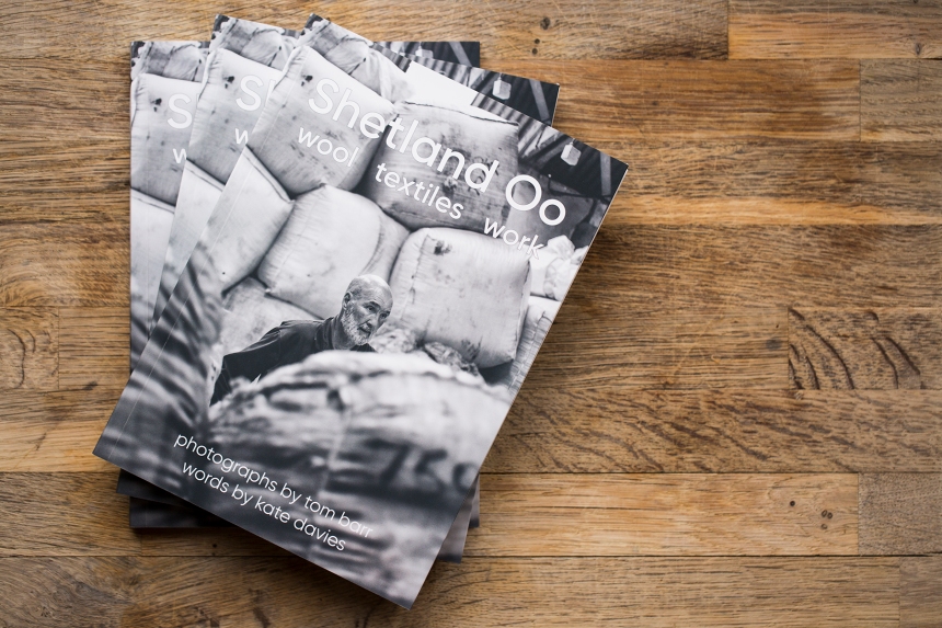
I spent a lot of time thinking about what size and shape the book should be. In the end I settled for a shape that would accommodate the majority of portrait shots and a size that was large enough for good image reproduction without being unweidly or bulky. I wanted the book to feel good in the hand and look neat when it was opened – not flop about.

Simplicity was my aim throughout when working on the layout. I read Kate’s text carefully, and chose and placed images where they best conveyed a sense of the book’s whole ‘story’. So, for example, the book opens and ends with a lighthouse – just as your journey would if you were approaching or leaving Shetland. I particularly enjoyed creating a visual narrative between the profiles – so, for example, a spun thread drawn out a machine at Jamieson’s mill on one page is almost caught up by Elizabeth Johnston working on her wheel on the next. My goal was to let the photographs and the accompanying text do all the talking, without any unnecessary design embellishments.
Gilroy is the font I chose for the book – a sans-serif font with simple, clean lines. Gilroy feels modern and geometric in nature, and is both useful and versatile to work with because it supports a range of opentype features.
Paper stock was another thing I thought long and hard about. I wanted something which would reproduce my photographs at their best, but might also make a positive contribution to the experience of reading the book and to the object itself. After examining countless books, and debating matters with our printer, in the end I selected an uncoated stock whose rough texture seemed especially appropriate for the subject matter of wool and work. The paper has a nice contemporary feel, and, because it has no coating, a heavier grade of stock can be used without adding unnecessary weight to the finished book-object. And as well as the look and feel, it also smells great! (Uncoated paper absorbs more ink so that when you first open the book you get that nice, familiar “booky” smell).
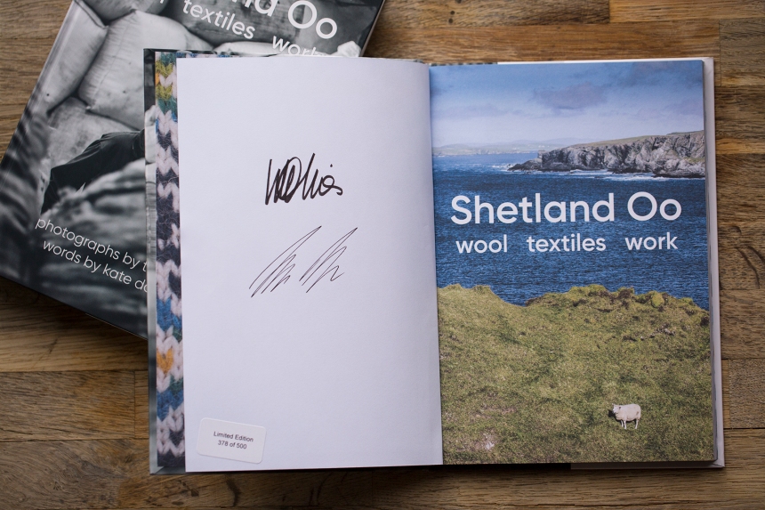
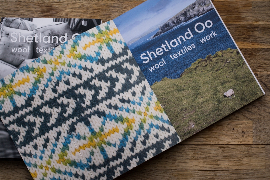
I love endpapers and think they are often one of the nicest things about hardback books as objects. When we agreed to produce a split edition (including some hardbound books as well as paperbacks in the print run) the first thing I knew was that we were going to have endpapers. I selected a swatch from the many that are hanging about this house (as I’m sure you can imagine) and photographed it. I really liked the way that the knitted chevrons led the reader to turn the page and enter the book, like a woolly welcome.

Having created the endpapers for the hardback, I felt the paperback would benefit from a similarly woolly welcome, so I designed over-sized covers with flaps which were printed on the inside with the same Fairisle pattern. After I’d decided that one of my portraits of Oliver Henry was going to work as the cover image, I was particularly happy with the way that I could carry the image over onto the front of the flap, with the Fairisle pattern on the reverse.
The covers of both editions are treated with a special velvety finish, and the paperback flaps also double up as a handy bookmark.
It was very important to me that the book was a really nice object – something with its own beauty both inside and out. As I’m sure you can tell, I am quite precise and exacting in my design requirements, and I have to say a massive thank you to our printers, Bell & Bain. As well as being a local business with a long history of producing top-quality books, they are also staffed by a wonderful, helpful team of people who really – genuinely – love books. I want to say a massive thanks to Derek, Ashley and Carole at Bell & Bain for their enthusiasm for this project and their advice throughout the process.
The finished book is something I feel very proud of. When I left my job twelve months ago to join Kate in the business of wool and knitting I did not imagine that I’d be designing and producing my own book in under a year. The fact that that this has happened is because of two groups of people: first, the Shetlanders who with unfailing grace and generosity allowed me into their lives to photograph their work and second, you, who are interested in what we are doing here with wool, with words, with photographs and with paper.
Thankyou.
If you’d like to read more about the photographic process behind Oo, our friend Felix interviewed me a few days ago over on her blog.
all the best
Tom.

Brilliant! I’m in the process of self publishing a book and your’s is the one that most inspired me! I’m writing about colour genetics in sheep so it is about knowledge transfer and lots of facts and detail but … Shetland Oo captures beauty! I want to capture some of that ! Can’t thank you enough! For the inspiration to tackle a ‘specialist subject’ most of all. I’m an amateur but I have a … vision… I won’t be as able as you are to make it come true but this post drove home the lesson that I really want it my way. It’s not about writing or photography. It’s about a concept. While I traveled in search of “viking sheep” I met some ofthe peolple mentioned. And I met them again in your book Well done!.
LikeLike
What a wonderful book.
I just have to order it now. I love the smell of books (some of them in fact).
Happy Holidays to you.
Christine
LikeLiked by 1 person
My book has just arrived, the last mail delivery before Xmas. What a great present. Hope you all have a wonderful Xmas.
LikeLike
You have given us a fascinating insight into the myriad of decisions involved in book design; I will examine books much more closely now. Must dash – I need to go an order one! Love the end piece (I didn’t know it was called that).
LikeLike
Tom and Kate, thank you for such a lovely book! It’s beautifully done. I am so in love with this book…photographs and text. I keep it bedside, and read a small section each evening, so as to savor every bit, and not rush through it. And dream of one day visiting Shetland…
LikeLike
I love Kate’s work, have bought many of her patterns on ravelry and have her book “Yokes”. Thank you for sharing the process of writing and producing Shetland OO. It is passionating! I just ordered the book as a Xmas present to myself :-). Snowy greetings from Switzerland!
LikeLike
Great job, Tom. Looking through the book I felt like I was standing in your shoes in the every day of people and places. Couldn’t ask for anything more from great documentary photography. It’s always a pleasure to see you work on the page. Of course, if it’s wrapped in Kate’s text that doubles the fun.
LikeLike
Dear Kate and Tom,
Thank you for the thoughtful book and sharing the process. I already have one of your book (Yokes) which I love and enjoy. I ordered the book, and I can’t wait to receive it.
LikeLike
Hello Kate, Tom and Bruce, congratulations on your work. I am following you for quite a while and I enjoy your posts!! I have your book of yokes and I tried to purchace your new book but this was not possible, probably because of my location. Could you please help?
LikeLike
Hi Athina, we ship all over the world so this shouldn’t be a problem -if you email us at info@katedaviesdesigns.com we’ll resolve whatever problems you are having with the shop!
LikeLike
I received my book yesterday and I have to say I am in awe. The photographs are beautiful and Kate’s texts really bring to life the history of wool in Shetland. As both a historian and an amateur photographer, this book really spoke to me at a deep level. Once I get my blog back in order, I can see myself writing many comments about various aspects of the book. Shetland is definitely high on my list of places to visit now.
LikeLike
So glad you enjoyed it!
LikeLike
It’s here! And it’s fantastic! Thank you for such a fine book and such quick delivery.
Thank you again, I’m looking forward to sharing it with the Christmas family celebration. Merry Christmas to you.
Stephanie Bonovich
Sent from my iPad
>
LikeLike
You and Kate put such love into all you do. Can’t wait for my copy of the book to arrive. Happy Holidays and thank you for the joy you bring to so many…
LikeLike
Tom- I am looking forward to opening my hardback copy on Christmas. A turkey sandwich and a new book on Shetland is my idea of heaven.
Hope you and Kate and Bruce have a wonderful holiday.
LikeLike
Aloha,
As a former member of the Sacramento Book Collectors Club and a new knitter, you’ve combined both my love of fine letterpress and wool!
Mahalo.
LikeLike
Excellent. I will get around to ordering if after Christmas. :)
Supplementary idea: love the endpaper closeup; would there be a place for such in your patterns, even just as a banner, especially in the Mag Cloud versions. It might be an aid in accomplishing the fairisle work?
Love you guys.
Very best to all for a peaceful Christmas season. robin
LikeLike
Can’t wait to receive my hardbound copy. So lovely to hear about all the decisions you made. I will appreciate the book even more… thanks!
LikeLike
Hi Kate and Tom!
Congratulations on doing such amazing work with wool, knitting, colours and photography – this is really earthy, creative stuff! I absolutely love reading your blogs and books.
From a snowy, beautiful evening in Canada.
Alison
LikeLike
Tom.
Thank you for the blog – it has added an whole other dimension to the book, thinking about the myriad decisions that had to be made. Not a bad author yourself!
LikeLike
Arrived home from work to find my copy of Shetland Oo waiting on the door mat Thank you will enjoy looking at it with a cuppa .
LikeLike
I love my book-gorgeous photos and context. Thank you. You have done a great job!
LikeLike
Something odd here…it is autocorrecting my spelling!
LikeLike
Oops! Spelt the name wrong! @outlier Does that mean the same as “Offcomer” would?
LikeLike
I was very excited to see that Tom now has a website for his photography – @outlier. How did I miss the launch for this?
What about cards and calendars?
LikeLike
My husband and I love the work you and Kate produce, Tom. It’s because of all the things you describe in this post that we will always support your work. Thank you for sharing your talent!
LikeLike
The book arrived. It is wonderful. Thank you.
LikeLike
Thanks, Tom! Your comments only adds to the specialness of the book! A true holiday treat!
LikeLike
I am smiling just reading about your journey to this finished book!
LikeLike
Enjoyed reading about the making of the book. Received an email that my copy is on it’s way to Michigan. Can’t wait for it to come. I also can’t wait for you to start selling your prints. Your photographs as well as Kate’s are always so beautiful.
LikeLike
Ah! So thats explains why nice books smell ‘booky’.
LikeLike
My book arrived at the weekend but I think not caught a glimpse of it as someone squirrelled it away to be wrapped for Christmas! I would like very much to cheat and open it early but I promise I will be good….
LikeLike
Thank you Tom. As a amateur photographer and a knitter (oh and someone who loves books) I knew I had to have this book. I love your photos when they appear on Kate’s site. You have such a way of capturing the essence of what you are shooting.
Cannot wait till mine arrives here in Sydney Australia.
LikeLike
Thank you, Tom, for such a wonderful and detailed description of the book and the how and why of putting it together. A great teaser. I am jealous of those in Europe who have already received their copy. But while I am impatiently waiting I am enjoying a snowy and cold start to the holiday season in the Upper Penninsula of Michigan where we also live on a lovely loch. Happy holidays to all of you. And congratulations!
LikeLike
I am pleased to say I have received my book and I can see and feel the high level of attention to detail you have put into this. Many, many thanks to you both for this wonderful book to add to my ever growing collection from Kate Davies Designs!
Karen x
LikeLike
Tom, I thoroughly enjoyed reading about the production of Shetland Oo from your perspective. I didn’t realize that you had left your job to join Kate Davies Designs. Weren’t you a medical doctor?
Thanks for a delightful read on this snowy December day in northeast Ohio.
LikeLike
I love my book, and was very lucky to get a hardback copy before they sold out. I love the smell of the book, and the feel of the paper, and spent a happy weekend looking at the wonderful photos. The photos made me want to return to Shetland and the beautiful black and white image of Emma Ibister’s hands made me feel quite tearful, all that love and experience captured so beautifully. Thank you.
LikeLike
Lovely work Tom, as soon as we heard about this book being made I knew it was absolutely a must have and it is really beautiful.
So interesting to hear about the process of creating a book too, thanks for explaining more about it and your choices in this post. Looking forward to your next project.
LikeLike
What a lovely back-story to the making of the book. Tom, your words/thoughts were so precise and heart felt that I immediately jumped over to the shop to order a copy. I too, wish I had jumped on the limited edition hard copy. I can’t wait to spend a few leisurely winter afternoons living inside the book.
LikeLike
Tom: You and Kate are so fortunate to share so many loves together. Your love of Shetland’s wool, land, people and animals and your love for each other (and us, your readers) come through loud and clear in everything that you both touch. Such an honor to read your own beautiful words here — those words, along with your photographs, design sense and artistry, leave me with chills (the good kind).
Congratulations on creating a masterpiece! I can’t wait to receive my hardbound edition any day now!!!
LikeLiked by 1 person
Oo is right! Have to tell you I teared up reading this post. To know so much Genuine Heartfelt work has gone into it I cannot wait to get my copy! You two will go down in Shetland History. Thanks for putting Oliver on the cover. Gie Brucie a smooch for me please :)
LikeLike
i am so sad to have missed the opportunity to order the hardcover edition, i love LOVE all yours and Kate’s books. loved this post too, your thoughtfulness and care is incredibly appreciated. thank you so much.
LikeLike
I have enjoyed your post immensely! It is wonderful to hear what work you’ve put into the book and how you made your decisions. And now, the last guest of your team – we await to hear from Bruce:)
LikeLike
Thank you so much for sharing the thoughtful choices behind the book design! It’s so nice to hear how you made these decisions. I can’t wait to see it — I have dropped many very unsubtle hints and have a feeling it’ll be waiting under the Christmas tree :)
LikeLike
After reading this I realized that you and Kate are a perfect match! You compliment each other in so many ways. I didn’t know that there would be so many things to take into consideration in making a book – besides the actual writing and photography – well done! I too was going to pass on this one but I think I will remedy that. Thanks Tom and Kate (and of course Bruce).
LikeLike
I have bought all your publications so far and was going to skip this book, until you swept me in today, Tom!
LikeLike
I’m so excited to have ordered my first copy! To have read his description was fascinating. I love learning how things come about, and this was really interesting. All the decisions are uniquely made at each step, just as the subject the book covers. So excited to receive my own copy, and will order more for friends!
LikeLike
Also, I want to say, grand job done! The book is beautiful and I’m looking forward to enjoying its uniqueness. Good job and Merry Christmas!
LikeLike
The first thing I noticed when opening the book was the lovely smell! Quite rare nowadays. There is so much to bringing out a fine work such as yours that one doesn’t realize. Thank you for itemizing some of the steps, explaining the thought and care that goes into it. I am pacing myself with the reading. I didn’t even ‘flip through it’ when I received it. I am allowed 4 pages in bed each evening! It’s a beautiful and emotional read, as one discovers the lives and livelihoods of Shetlanders.
Have a happy Christmas, and a good rest.
LikeLike
I thought I had ordered this book; but, sadly, I had it confused with my purchase of Inspired By Islay. I must remedy this error right away.
LikeLike
I have rectified my error and ordered a copy for a friend as well as one for myself.
LikeLike
Lovely looking book. When will it be published?
LikeLike
It was published a couple of weeks ago and is available from shopkdd.com
LikeLike
This leaves me with an even greater sense of anticipation as I await my copy! Thanks for the hard work and the interesting description of it. I hope that you two can complete your work before Christmas and have a happy, relaxing break.
A scratch behind the ears for Bruce,
Kate
LikeLike
Looking forward to my copy arriving !!!!!!
LikeLike
I really enjoyed the lovely ‘booky’ smell as I had a quick flick through this morning. Looking forward to a ‘proper read’ this evening.
I particularly ordered the hardback so I can knit while reading.
LikeLiked by 1 person
Fine work!
Sent from my iPhone
>
LikeLike
I’m so excited to receive my copy. This seems like an awesome endeavor. I’m a knitter who has never knit with British wools, but I’m fascinated by the people, landscapes and garments they inspire.
Gratefully
Shelley
Sequoiashelley on Ravelry
LikeLike
Thank you Tom and Kate for all of your hard work. I can’t wait to receive my book and share it with my wool friends!
LikeLike
And kisses to Bruce!
LikeLike
I am anxiously awaiting my copy and so very much appreciate the notes on your immensely thoughtful production process! Clearly you and Kate are two peas in a pod!
LikeLike
I’m so looking forward to the book and spending time with it. I know it takes a while to ‘cross the pond’ so I’ll just have to wait patiently. In the meantime, I love the updates you and Kate have done. Happy Holidays to you Kate and Bruce!!!
LikeLike
Oooo! I’m dying to have this book of yours in my hands!
LikeLike