
I find it fascinating how a different set of colours can change the feel of a garment.

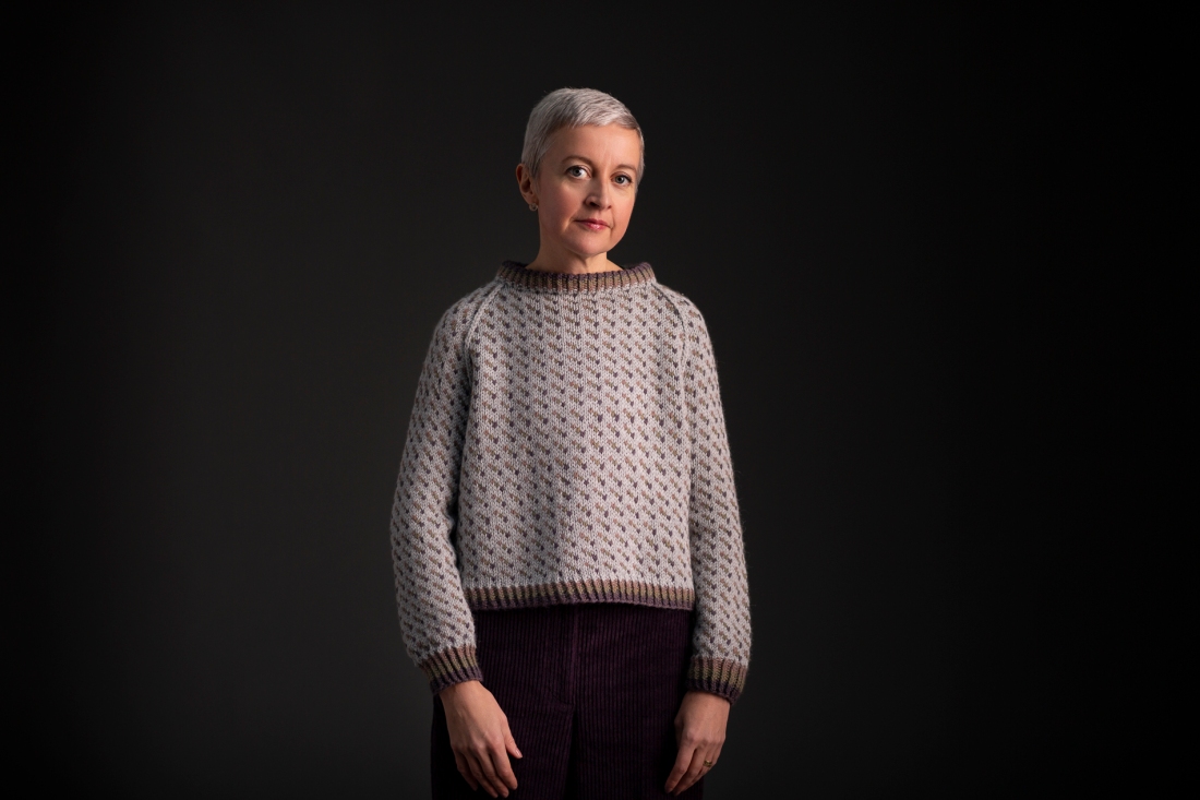
Here’s the Weel Riggit pullover, in four very different shades of our lovely new Àrd Thìr yarn . .

Camusdarach (grey); Firemore (mauve-ish); Kintra (dusky pink) and Husinis (khaki-ish).

This palette creates a softly muted gradient – very different to the cool-toned sample I showed in last week’s post.

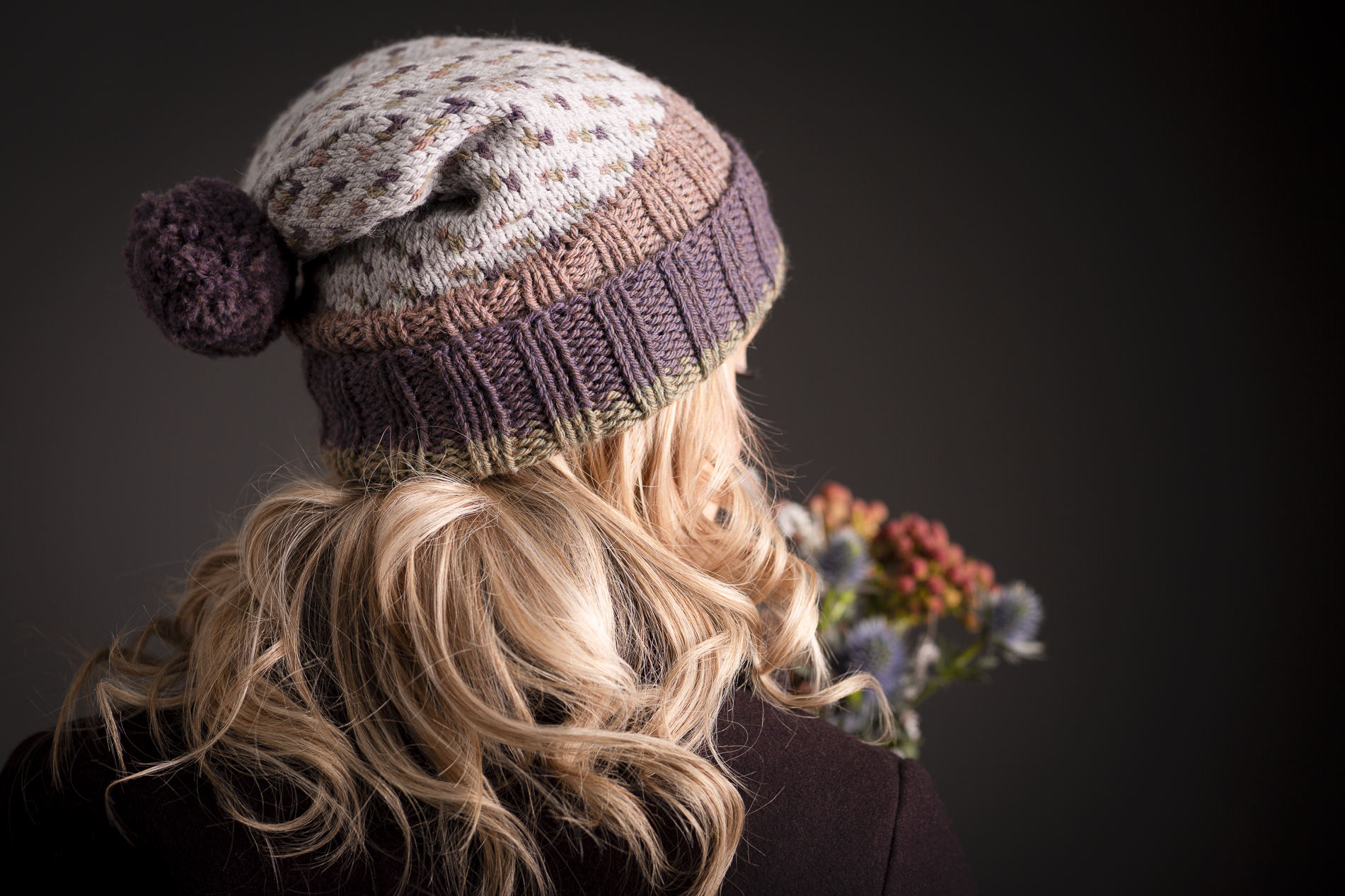
I liked this combination so much I designed a hat in it too!

The Weel Riggit hat is available to everyone as a Ravelry download (Knitting Season club members receive this pattern as a free bonus with their subscription)

With a deep, folded brim, it’s the ideal hat for the current cold snap.
What do you think of our new studio photography?
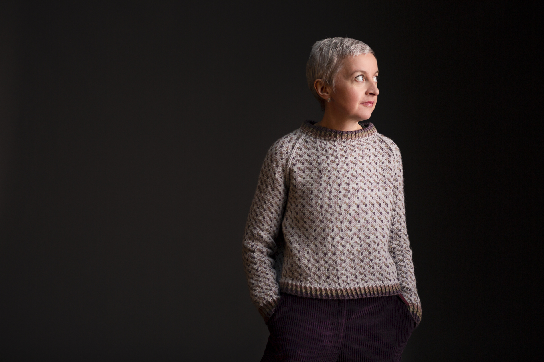
I love the way that there’s no distractions in these images – that you really focus on the knitwear . . .
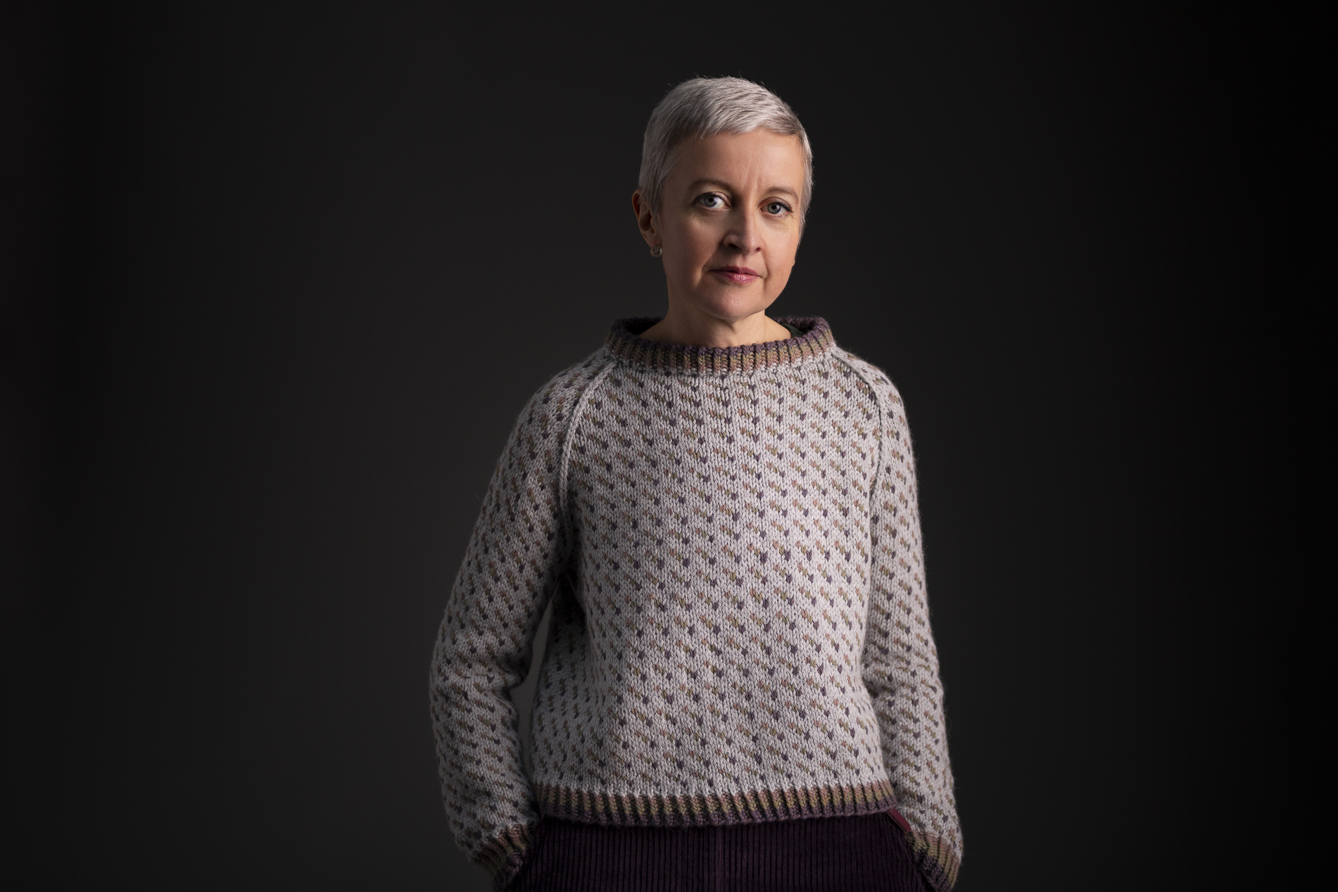
But studio photography is a new and somewhat weird experience for me as a model – there’s really nowhere to hide!

Which colourway of Weel Riggit do you prefer – Ardnave (blue) or Camusdarach (grey)?

1. I love the interplay of colour too and am equally fascinated. This fascination has only deepened since starting spinning and now dyeing yarn. So. Many. Options.
2. Love the colour palette in both versions and the overall palette of the new yarn.
3. Also love the sweater pattern. I find something so rhythmically satisfying about the lice pattern.
4. But those purple cords are EVERYTHING!
LikeLike
The knitting season is such a lovely easy knit. Colorful and fun. I have a sweater going but this would be fun for a take along project.
I wonder if you realize that the color you have chosen to use in the description of your new book is so light that I’m guess in many people can’t read it? I know I can’t. Its terrific as a stylistic look but not helpful if I can’t read it. Seems like this is a new trend these days as I see it often. Layout must be done by young eyes.
Pat
LikeLike
Hi Pat – could you let me know which page you are referring to and we will try to address this. Sometimes different browsers show text differently.
LikeLike
The blue because the contrast colours on the grey aren’t my palette.
I like the studio photographs with the dark background. As you say, it doesn’t detract from the knitwear. I much prefer this to the very bright, white styling in the new Rowan magazine which felt a bit unnatural.
LikeLike
I loved the grey when I first saw the hat design but the blue will be great on some people. Like others, I do really enjoy the knits in the landscape photography but the studio ones work really well and I imagine allow you to work whatever the weather!
Yet again, your essays and designs are making getting through this tough part of the farming year easier! I am celebrating having finished my Carbeth just in time for the snow down here.
LikeLike
I still haven’t made up my mind on which colour combination I prefer. And sometimes it is so difficult to judge colours on the computer screen. But I do prefer the outdoor shots.
I find that since my hair is silver that I have to stick to the cool tones. Beige/warm tones wash me out. But they look so good on you. Will you be offering a kit in both combinations? The one thing that I absolutely do love is the purple corduroy trouser. Where did you get them?
LikeLike
My favorite is the Camusdarach. It has a subtle camouflage effect that appeals to me. I am personally drawn to the light color melange in the body of the sweater the darker solid coloring near the neck. It would suit my very pale skin and brown eyes much more. All said, they are both beautiful colorways!!
LikeLike
I love them both but prefer the one with the pink shades. I also adore the hat. I belong to the Knitting Season Club but haven’t seen the pattern show up in my library yet. Is there something I’m not seeing?
LikeLike
yes – you will have received a separate download code for the hat last week? if you email us at info@katedaviesdesigns.com we can check on this for you.
LikeLike
I found it! Thanks so much.
LikeLike
Wow this is just stunning! I loved the blue but this is calling to me in a whole new way. And the studio photography – marvelous! So crisp! But I love all the landscape photos too! Basically I am just in love with everything!
LikeLiked by 1 person
Love this sweater ! Your second choice of colors are perfect for you. For those of us who love to knit, it is so inspiring and interesting to see what a difference a change of colors can make to a pattern.
LikeLike
My ipad doesn’t display the colours very well I don’t think, so it’s hard to say, but I love the pattern, and from earlier posts, for me the blue, always the blue! Interesting photos, and lovely, but I’m sorry to say that I prefer to see you in your outdoor environment. I do ‘get’ that outdoors is a lot more difficult, especially at this time of year. I love and admire your posts regardless. Thank you.
LikeLike
I too would normally gravitate to the blues, but I’m finding myself attracted to the Camusdarach in these designs, at least for the hat. The photography is lovely—the studio shots have a painterly quality which is very evocative and pleasing (and must be a lot of fun for all of you, as well as providing new challenges). And I love the outdoor shots as well. The studio shots let you focus on the garments and the outdoor shots let you envision yourself wearing them out in the world. All in all, beautiful!
LikeLike
Usually I gravitate towards blues and greens, but for this sweater I personally prefer the Camusdarach colors, mostly because I see the gradient more clearly. Love, love the background blue in Aardnave, but it sort of swallows the colorwork.
LikeLike
I don’t know how any of your fans could imagine that you’d abandon outdoor shots and convert to indoor shots or would prefer indoor shots in the future! Clearly they have somehow missed your essence. I think you & Tom likely are Scotland’s number one marketers! Seeing how frigid-appearing the last outdoor shots appeared I have no questions as to why you modeled this sweater indoors! We don’t want you to get frostbite or for Tom’s hands to get frozen onto his camera! It is likely another technical challenge for Tom to do indoor studio shots. I sense that he is truly always a man up for another challenge, just as you are a woman always up for another challenge! Part of why you are perfectly well-suited to each other!
The indoor and outdoor shots are great! The sweaters and color combos are wonderful! Carry on and stay warm!! Tea and hot cocoa!!
LikeLike
Absolutely – there will be no abandonment of the great outdoors – but sometimes I think a combination of pics is probably useful. Especially during weeks of relentless rain. . . .
LikeLike
Love the Camusdarach! Maybe it is the way the colours came out on my screen with the blue one. Could only see the White dots, never saw other colours. ‘No where to hide’ in a stark setting……..too true :) Like the outdoors shots.
Take care.
LikeLike
I like the grey version better. There’s something classic and natural about it.
LikeLike
That last photo of you is so reminiscent of Girl with a Pearl Earring. A very Dutch painterly quality to the shot, which highlights your beauty as well as that of the sweater (love this colourway).
I like the contrast of the studio shots and hope you’ll find a way to balance these with the location shots. That way we get to see the detail of the knitwear unencumbered by distractions, but then also how they work in the real world (although my real world is significantly less picturesque than yours! ;-) )
LikeLike
I love the studio shots. They really bring out the detail in the knits and the models. :) The outdoor shots are also lovely, of course, but it’s nice to mix it up.
I love these designs- especially the 3-color brim on the hat! I never would have thought of it and it’s gorgeous. It’s a heartbreaker I’m allergic to alpaca, because I’m sure this yarn is amazing and the colors are breathtaking. Ah well. I’m sure a double strand of Buachaille would do the trick!
LikeLike
Hope the pattern will be available soon to buy for those of us who have not.joined the club. Thank you.
LikeLike
Far and away, I prefer the blue color way. They both suit you (the blue does accentuate your eyes) but I have a question about the fit! The gray sweater seems to have a Swingy, A-line shape, but the blue looks straight in yesterday’s profile photos. Is this an option for shaping in the pattern? As to location, again a strong preference this time for the outdoors, although I do appreciate how the garment takes center stage in the studio photos. You always look so warm, comfortable and happy outside, and the scenery is beautiful. I am happy to know this yarn will be widely available, because, well those blues and silvery gets/greens! Did I mention I just love them??
LikeLike
I love the sweater today, but I prefer Tom’s outdoor shots. The WHW scenery beats any studio hands down.
LikeLike
Both are gorgeous in their own rights…just a question of which colourway a person is most drawn to. And for the setting, the outdoor shots feel more natural, personal and real, but I agree that the studio shots are more focused on the actual subject. (That said, I’m a blue and outdoorsy gal.)
LikeLike
The colors you have on here are my favorites. Both variations are gorgeous, but have such different feels to them. Just love this pattern and Weel Riggit hat. Wonderful photos as always. “No where to hide” 😅
LikeLike
Love the blue but am very attracted to the gray. It is so nice to see your local in the beauty shots of your work outside but studio shots do really force focus on the knitting. Sometimes the outside shots are a bit far away to really see details. I am greedy: I would love to have both settings for all your patterns!
LikeLike
And by the way, I LOVE the second color palette, so sophisticated!
LikeLike
The studio photography is beautiful, and certainly shows the garments in very artistic fashion, but, to me, the outdoor styling and photography, and the descriptions and even history of the settings, are such an integral part of your work. I really look forward to them, especially being on the other side of the Pond and mostly trapped in an urban environment:)
LikeLike
I miss the landscapes. One of my favorite parts of your posts are the glimpses of beautiful Scotland.
LikeLike
I love blue instantly and always. While the gray version is in colors that I’m not usually attracted to on their own, you’ve brought them together so beautifully that I could imagine wearing them in this design. By the way, those trousers are so gorgeous! Serious heart eyes over here.
Like others, I see the value of the studio shots but love the outdoor shots. It never even occurred to me to want to visit a place with a climate so like my own (Pacific Northwest) until i started reading your blog. Now it’s number 2 on my list (after the Caribbean). As always, thank you for the inspiration.
LikeLike
When I read the title Ï thought this would be a post presenting all of the shades of the new yarn and the meaning of their names, as you did in the past for both Buachaille and Milarrochy Tweed. So I was a bit disappointed (although both the new colourway and the studio photos were gorgeous to look at!) as I really loved to read these explanations — are you going to write one also for Ard Thir?
LikeLike
I forgot to add that I miss the landscapes in the background though…
LikeLike
I like the studio shots. They have a purpose and do showcase your beautiful work!
Personally for me, the brown palette would not suit my hair colour and skin tone, so brighter colours would work for me.
LikeLike
Now here’s the thing; I wasn’t keen on the blue version at all but when I saw the grey, where you’d included my favourite heathery colours, that was it, I was smitten! Apart from the fact that purples are my favourite colours I am not usually drawn to a pale silvery grey, preferring a darker shade, so I was surprised that I chose that colourway but I’m glad I did as it’s beautiful and has made me get out of a colour rut. I will be making the hat too as it will complement my beloved purple Carbeth.
I like the stark contrast of the Studio photos but I also enjoy seeing your creations outside in the wild too Kate.
LikeLiked by 1 person
I love this softly warmer combination; the colors work so subtly and cheerily together. The hat is a beauty too.
LikeLike
I much prefer this one, and the studio environment show it up better. I like the photo where you can see that bottom of the back is not snug but hangs out a bit. That’s good. Seeing the first one I didn’t think I’d do it, now I think I might!
LikeLike
I am seriously considering Camusdarach. The colours are beautiful and put together in this combination really do come into their own. When I first saw the studio photography I did not like it at all. It has since started to grow on me and yes one can focus on the garment. Like other people I think a combination of studio and outdoors would be perfect.
LikeLike
The studio shots do look great photographically, but they are far less appealing to me than your outdoor shots. I love your work in no small part because you tie it so deeply to your landscape. The history of knitting seems so very place-based that that approach would appeal to me even if I weren’t a rabid biker and huge Scotland enthusiast. Since I am, the outdoor shots fill me with glee (and, every single time, a dangerous impulse to buy a plane ticket!).
Thanks for all you do, indoors and out. Can’t wait until tomorrow!
LikeLike
Rabid Hiker. Oops!
LikeLike
Your colourwork continues to delight. While I could see the Ardnave, I would never have created your Camusdarach combination – and both are lovely in such unique ways. I plan to purchase your sampler for this new yarn to see the colours firsthand.
As regards the photography, I find the studio work to be quite sombre. It possesses a deep, painterly quality in its style and composition but it is missing the energy and joy from your outdoor shots. It is beautiful to see your work outside in natural light, my eyes keep looking for that light and natural beauty. Thank you for your work.
LikeLike
For the studio shots with black background, Is there a way to code the image so it would print with a white background? I’d hate to use up that much black ink, and the paper would come out of the printer wet.
LikeLike
I miss the outdoor shots! So much more evocative. Nothing wrong with some studio shots to highlight the knitwear, but please share your gorgeous landscapes with us, too.
LikeLike
I really want to cast this on right now, but I need to finish some things first. I love all your photography but must admit that the outdoor shots work for me. I just love the fabulous scenery, it lifts my spirits.
I just want to share with you that I too have let the grey through and gone short x
LikeLike
The studio photography is gorgeous, but pretty brutal on those of us printing at home since there are pictures with (essentially) black backgrounds on every page of the pattern. I love both colorways, but the Ardnave is calling my name. Can’t wait to try out the new yarn!
LikeLike
The blue colors are my favorite but the rest of them are also so attractive. The really dark studio photography, although lovely, is sometimes too dark and makes the intended portrait to hard to see.
LikeLike
I like both colour variations for different reasons. The grey is very subtle and has a warming glow. Blue is an all time favourite colour for me so I tend to gravitate towards it. My problem is that I’ll see a colour or combination, fall in love with it only to find it does nothing for me. Interesting Kate that you mentioned in a recent post that following the change of hair colour you are now able to wear colours you had previously steered away from. Perhaps that’s the answer!🙂
LikeLike
I think the blue on light background works much better visually, the grey brown version might benefit from a lighter base, more contrast could be livelier and brighter. Nice design though and the yarn looks well squishy…yum
LikeLike
I would wear the grey colourway myself. The blue looks more masculine but I like you in the blue .
(With the big white gloves)
J x
LikeLike
I love studio and outdoor, but do slightly prefer the outdoor photography as your landscape is so beautiful and always a treat to see you with your knitwear in it. A combination of both would be perfect.
For the colours – I always tend to the cooler colours as I’m a winter type, from both perspectives of colour type and inner feeling as I love the winter. But with this design I find both equally beautiful, especially the way you combine them with the your trousers.
Looking forward to seeing you in Edinburgh as I was lucky to catch a ticket for your speech. And after the EYF we travel to Luss to have a good look and walk around Loch Lomond for 1 week – triggered by your pictures and last years club.
LikeLike
I love Camusdarach the most. Particularly in winter time, the clear clarity of the colours so remind me of the sky and lakes, and the frost on the trees.
LikeLike